Mixing patterns and textures can elevate your interior design from bland to breathtaking—but doing it wrong can lead to visual chaos. The key is balance, contrast, and harmony. Whether you’re revamping your living room, bedroom, or any space, these professional tips will help you master the art of blending patterns and textures like a seasoned designer.
Art of Mixing Patterns and Textures

1. Start with a Neutral Base
Before adding bold patterns, establish a neutral foundation (walls, large furniture, or flooring) to prevent overwhelming the space. Starting with a neutral base is essential for creating a balanced and harmonious space. Before introducing bold patterns or vibrant colors, focus on establishing a calm and cohesive foundation using neutral tones for walls, large furniture pieces, and flooring. This approach ensures the room feels inviting and spacious, rather than chaotic or overwhelming. Neutral shades like beige, gray, or soft whites provide versatility, allowing you to layer in bolder elements gradually. By keeping the base understated, you create a timeless backdrop that can easily adapt to changing styles or accents over time. This method also helps highlight statement pieces or patterns without competing for attention, resulting in a polished and well-designed interior.
Pro Tip:
– Use soft beige, white, or gray tones as a backdrop.
– If you’re unsure where to begin, consult an expert interior designer in Delhi for a tailored approach.
2. Follow the 60-30-10 Rule
A foolproof way to balance patterns:
– 60% Dominant Pattern (e.g., large-scale florals or geometrics on upholstery)
– 30% Secondary Pattern (e.g., stripes or checks on curtains)
– 10% Accent Pattern (e.g., small polka dots or animal prints on cushions)
Example:
– 60% Neutral sofa with a subtle texture
– 30% Bold striped rug
– 10% Colorful throw pillows
3. Vary the Scale of Patterns
Avoid clashing by mixing large, medium, and small patterns. To create visual interest without overwhelming a space, mix patterns of different scales—large, medium, and small. A large-scale pattern, such as a bold floral or geometric wallpaper, can serve as a focal point, while medium-scale designs, like a striped rug or checkered throw pillow, add depth. Smaller patterns, such as delicate polka dots or subtle textures, provide balance and prevent the look from feeling too busy. This layering technique ensures harmony, as the varied sizes prevent clashing while keeping the design dynamic. Additionally, tying them together with a cohesive color palette helps unify the overall aesthetic for a polished and intentional finish.
How to Pair:
– Large floral wallpaper + medium geometric cushions + small pinstripe throw
– Big chevron rug + tiny polka dot curtains
4. Stick to a Cohesive Color Palette

source: pintrest
Choose 2-3 main colors and vary their shades for harmony. To maintain balance and harmony in your design, select 2-3 main colors and use them consistently throughout the space. By varying their shades, tints, and tones, you can add depth without introducing visual chaos. For example, if your primary colors are navy blue, blush pink, and warm gray, you might use deep navy for upholstery, soft blush for curtains, and light gray for walls. Incorporate different textures and finishes (matte, glossy, metallic) to keep the look dynamic while staying within the chosen palette. This approach ensures a polished, intentional aesthetic while allowing flexibility for pattern mixing and accent pieces. Keeping the color scheme restrained also makes it easier to update the decor seasonally with small, interchangeable accessories.
Color Mixing Ideas:
– Navy, cream, and gold (for a luxe look)
– Sage green, terracotta, and white (earthy & modern)
💡 Expert Insight:
An interior designer can help you select a palette that suits your space’s lighting and vibe.
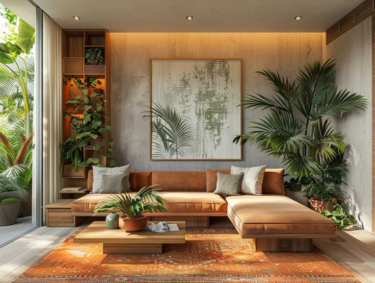
5. Blend Different Textures for Depth
Patterns pop when paired with contrasting textures. Patterns stand out best when layered with a mix of textures, creating a rich, multidimensional look. Pair smooth, glossy surfaces (like silk or lacquered furniture) with rough, tactile elements (such as woven baskets, chunky knits, or raw wood) to add contrast and intrigue. For example, a bold geometric-patterned sofa could be balanced with a nubby wool throw, a sleek metal side table, and a jute rug. This interplay of textures not only enhances visual interest but also makes the space feel more inviting and dynamic. By thoughtfully combining matte, shiny, soft, and coarse materials, you ensure that patterns shine without overwhelming the room, resulting in a sophisticated and well-curated design.
Texture Pairings:
– Smooth velvet sofa + rough jute rug
– Glossy ceramic vase + knitted throw blanket
– Matte concrete side table + shiny metallic lamp
6. Use Solids as Breathing Space
Not every piece needs a pattern—solid-coloured elements help balance busy designs. While patterns add energy and personality, solid-colored elements are essential for creating balance and preventing visual overload. Incorporate neutral solids—like a beige sofa, a crisp white wall, or a charcoal throw—to give the eye a place to rest amidst bold prints. These understated pieces act as anchors, allowing patterned accents (like pillows, rugs, or artwork) to shine without competing. For example, pair a vibrant floral chair with a solid navy wall, or layer a striped rug under a solid wood dining table. This contrast ensures the space feels curated, not chaotic.

source: pintrest
Where to Use Solids:
– Plain curtains between patterned walls
– Neutral chairs in a bold dining space
7. Repeat a Motif for Cohesion
Echo a single pattern (like stripes or florals) in different scales across the room. To create a unified yet dynamic space, carry a single pattern—like stripes, florals, or geometric shapes—throughout the room in varying scales. For example, use large-scale floral wallpaper as a statement wall, then echo the motif in medium-sized floral throw pillows and a subtle floral-patterned rug. Even smaller accents, like a dainty floral vase or artwork, can tie the theme together. This repetition builds rhythm and harmony, making the design feel intentional rather than random. By keeping the motif consistent but playing with size and placement, you achieve a layered, curated look that’s visually engaging without feeling cluttered or mismatched.
Example:
– Striped wallpaper + thinner striped cushions + a striped rug in a different color
8. Test Before Committing
Lay out fabrics, wallpapers, and samples together before finalizing. Before making permanent design choices, gather physical samples of fabrics, wallpapers, paint swatches, and finishes to see how they interact in your actual space. Lay them out together under different lighting conditions—daylight, evening, and artificial light—to observe how colors and textures shift throughout the day. Move samples around the room to test placement: drape fabric over furniture, tape wallpaper samples to walls, or place rug samples on the floor. This hands-on approach helps you spot clashes, assess scale, and ensure balance before investing in costly materials. Taking this extra step prevents regrets and ensures a cohesive, well-thought-out result that truly works in your home.
Quick Check:
– Step back and squint—if anything feels jarring, adjust.
– Take a photo; sometimes, the camera catches imbalances.
9. Know When to Break the Rules
Once you’re comfortable, experiment! Try:
– Mixing 4+ patterns in a monochrome scheme
– Unexpected combos (tropical + plaid)
Daring but Chic:
– A leopard print chair in a minimalist room
– Paisley and houndstooth together (if colors align)
10. Get Inspired by Professional Designs
If you’re unsure, seek inspiration from experts. A skilled interior designer can create a custom plan that reflects your style while ensuring perfect pattern harmony. If you’re hesitant about mixing patterns, turn to expert-designed spaces for guidance. Study interior design magazines, curated Pinterest boards, or showhouse projects to see how professionals balance bold prints with neutrals, layer scales, and unify colors. Notice how they repeat motifs or use texture to add depth without chaos. For a personalized touch, consider hiring an interior designer—even for a single consultation—to help tailor these principles to your space. They can create a cohesive plan that aligns with your taste while avoiding common pitfalls. By learning from the pros, you gain confidence to experiment while ensuring a polished, intentional result.
Final Thoughts
Mixing patterns and textures is an art—start subtle, build confidence, and have fun! The right combination can make your space feel dynamic yet harmonious.
Which pattern mix are you excited to try? Share in the comments!