Choosing the right colour palette for your home is more than just picking shades you love—it’s about creating harmony, influencing mood, and enhancing the functionality of your space. Whether you’re redecorating a single room or your entire house, the right colours can transform your home into a cohesive, inviting sanctuary.
In this guide, we’ll explore:
✅ The Psychology of Color – How hues affect emotions and behavior
✅ Scientific Research on Color & Interior Design – What studies reveal
✅ Step-by-Step Process for Selecting a Palette – From inspiration to execution
✅ Popular Color Schemes & How to Use Them
✅ Common Mistakes to Avoid
By the end, you’ll have all the tools to confidently choose a colour scheme that reflects your personality and enhances your living space.
How to choose the Perfect Color Palette
1. The Psychology of Color: How Hues Influence Mood & Perception
Colors have a profound psychological impact, affecting emotions, productivity, and even appetite. Here’s what science says about different shades:
Warm Colors (Reds, Oranges, Yellows)
– Red: Stimulates energy and passion (great for dining rooms but can increase stress if overused).
– Orange: Promotes enthusiasm and creativity (ideal for home offices or workout spaces).
– Yellow: Evokes happiness and warmth (best in kitchens but avoid overly bright shades, which can cause anxiety).
Research Insight: A study by the University of British Columbia found that red enhances attention to detail, while blue boosts creativity.
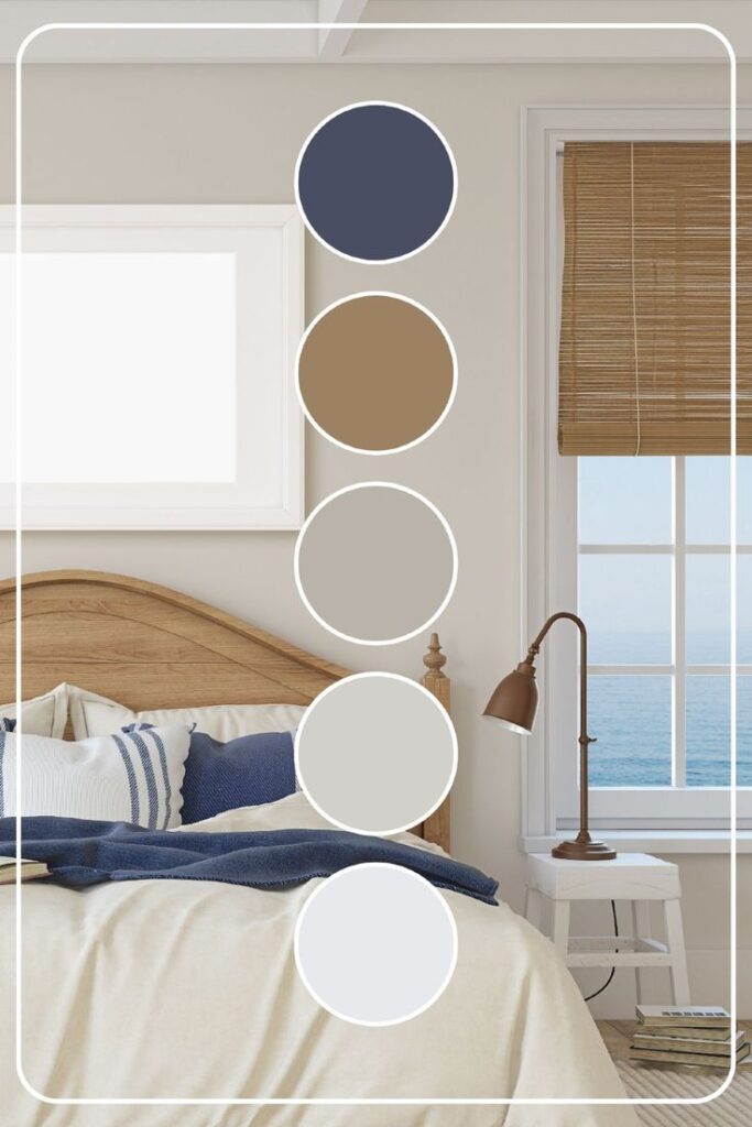
Cool Colors (Blues, Greens, Purples)
– Blue: Calming and serene (perfect for bedrooms and bathrooms).
– Green: Associated with nature and relaxation (great for living rooms and studies).
– Purple: Connotes luxury and creativity (works well in accent walls or decor).
Research Insight: A NASA study found that blue lighting helps regulate circadian rhythms, improving sleep.
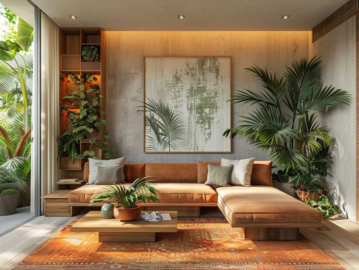
Neutrals (Whites, Grays, Beiges, Blacks)
– White: Creates a sense of space and cleanliness (but can feel sterile if not balanced).
– Gray: Sophisticated and versatile (works as a base for bold accents).
– Black: Adds drama and depth (best used sparingly in modern interiors).
Research Insight: A Pantone Color Institute report found that neutral palettes increase perceived home value by making spaces look larger and more adaptable.
2. Scientific Research on Color in Interior Design
Several studies highlight how color choices impact well-being and home aesthetics:
The Impact of Color on Spatial Perception
– Light colors make rooms feel larger, while dark shades create intimacy.
– A study in the “Journal of Environmental Psychology” found that warm-colored walls appear closer, whereas cool tones make walls seem farther away.
Color & Productivity
– Green and blue hues improve focus, making them ideal for home offices.
– Research from the University of Texas suggests that bland, monotonous colors decrease productivity.
Color & Emotional Well-Being
– Soft blues and greens reduce stress, which is why spas and hospitals often use them.
– A study in “Color Research & Application” found that people in brightly coloured rooms reported higher energy levels.
3. Step-by-Step Guide to Choosing Your Perfect Palette
Step 1: Find Inspiration
– Browse Pinterest, Instagram, or interior design magazines.
– Look at nature, fashion, and art for unexpected color combinations.
Step 2: Consider the Room’s Purpose
– Bedrooms: Soft blues, greens, or warm neutrals for relaxation.
– Kitchens: Warm whites, soft yellows, or bold reds for energy.
– Living Rooms: Balanced neutrals with pops of color for versatility.
Step 3: Use the 60-30-10 Rule
– 60% Dominant Color (walls, large furniture)
– 30% Secondary Color (curtains, rugs, accent chairs)
– 10% Accent Color (throw pillows, artwork, decor)
Step 4: Test Colors in Different Lighting
– Natural daylight, artificial light, and evening light can drastically alter how a color looks.
– Paint swatches on multiple walls and observe them at different times.
Step 5: Create a Cohesive Flow Between Rooms
– Use a consistent undertone (warm or cool) throughout the home.
– Repeat accent colors in different rooms for harmony.
4. Popular Color Schemes & How to Use Them
Monochromatic
– Variations of a single color (e.g., light blue, navy, sky blue).
– Best for: Small spaces, minimalist designs.
Analogous
– Colors next to each other on the color wheel (e.g., blue, blue-green, green).
– Best for: Creating a soothing, harmonious feel.
Complementary
– Opposite colors on the wheel (e.g., blue and orange, purple and yellow).
– Best for: Bold, dynamic spaces (use one as the dominant and the other as an accent).
Neutral with Pops of Color
– Base of whites/grays with vibrant accents (e.g., beige walls + emerald green sofa).
– Best for: Timeless, flexible interiors.
5. Common Mistakes to Avoid
❌ Ignoring Lighting – A color that looks perfect in-store may appear different at home.
❌ Overlooking Undertones – A “white” can be warm (yellow-based) or cool (blue-based).
❌ Too Many Bold Colors – Can feel chaotic; balance is key.
❌ Forgetting About Flow – Each room should feel connected, not disjointed.
Final Thoughts: Your Home, Your Canvas
Choosing the perfect colour palette is both an art and a science. By understanding colour psychology, lighting effects, and design principles, you can create a home that’s not only beautiful but also enhances your daily life.
Which color scheme speaks to you? Share your thoughts in the comments!